15. Wake Forest

It doesn't matter if we're talking about the letters or the Demon Deacon himself--this logo is bad. I understand that not every school is going to go for the modern, edgy look, but this feels like it's more of a business logo than a sports logo.
14. Georgia Tech
It's almost as if the same guy that made the Wake Forest logo decided to just "Ctrl+C, Ctrl+V" and Voila! Just change the letters, and hey, let's squish them together a little. Yeah? No. Bring back Buzz.
13. Syracuse
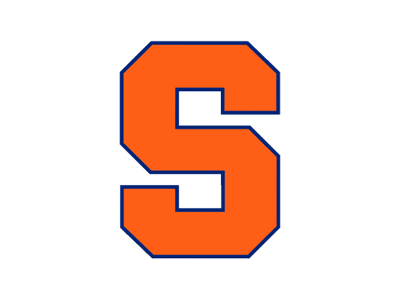
Alright, I'm gonna level with ya. I'm not a huge fan of letters as logos. There are a few exceptions. This isn't one of them. At least the colors make it look somewhat sports-related.
12. Pitt

Well, at least these letters make a word. Or an abbreviation of a word. Eh, close enough. I'm not going to harp on them too much, but they had something going with the old panther logo. Not that the panther looked good, but it gives you something to work with instead of these dang letter-logos.
11. Notre Dame

I know, I know. Notre Dame isn't part of the ACC in football. However, the majority of teams on their schedule are in the ACC, and they are a part of the ACC during basketball season. Don't get me started on it. As far as I'm concerned, they're in the ACC. Anyway, back to more pressing matters. Surprise, surprise. More letters. At least these letters look decent. I'll say this much: I actually kind of like this one, especially when you compare it to that awful leprechaun logo that still shows up every now and then. *Shudder* That thing creeps me out.
10. North Carolina State

Ok, now we're starting to get somewhere. Letter-logos can be alright, but there has to be something done with them, kind of like this. While this isn't the best in the conference, it's not a bad logo. The only thing I have an issue with is the abundance of black behind the N and C. Other than that, there isn't much to complain about (aside from the whole letters only thing).
9. North Carolina

This is one of those logos that you kind of forget is made up only of letters. For that, I applaud the marketing team. This one is smooth. The nice dark blue outline on the Carolina blue font adds just enough contrast to make it stand out without being an eyesore.
8. Duke

Alright, Duke fans. Quit gloating about how your logo is better than UNC's. This is another example of a logo that makes you forget that it's just a letter. It's simple, yet sharp and instantly recognizable--all trademarks of a great logo.
7. Florida State
Finally. Something that's not just letters. Don't get me wrong, letter-logos can work, but most don't. Anyway, this logo finally got the update it deserved recently. The warpaint looks less like bacon and more like, well, warpaint. The Seminole himself looks ready to go into battle, something FSU fans have had to do numerous times over the past couple of seasons. Getting rid of the "Florida State" in the feather and replacing it with "FSU" was also a nice, modern touch.
6. Clemson
Another simple yet sharp logo. The thing that really draws me in with this one is the fact that it's not clean-cut. The imperfections around the outline make this logo come alive, as if a real tiger left this print while stalking its Gamecock prey. Nicely done.
5. Virginia Tech
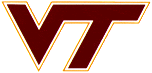
Write this down. I like this letter-logo. Something about it catches my eye. Maybe it's the colors. Maybe it's the sharp angle of the text. Maybe it's the colors. Say what you will about the team; they have a pretty great logo.
4. Miami
Phew. It doesn't get a whole lot better than this. Yet another simple logo that is instantly recognizable. And the colors. Mm. I'm all for this one. Also, bonus points for the hand sign. Genius.
3. Boston College

Although BC's football program has been a little off the radar for a few years, their logo should be on everyone's radar. I didn't realize how great this logo was until I started working on this article. The letters are sharp without being edgy, and the eagle is the perfect blend of realistic and cartoon. This one gives the two logos ahead of it some serious competition. So much so, I'm not sure I wouldn't rank it higher on a different day. This is how you make a logo.
2. Louisville

Cardinals don't have teeth--unless you're a Louisville fan, that is. One of my personal favorite logos of any level of any sport, this cardinal means business. This is a prime example of how to take a non-threatening animal and make it look like it's going to beat the life out of the next thing that moves. Everything about this logo screams perfection.
1. Virginia
Ah, here we are. The top of the ACC logos. There is absolutely nothing to change or criticize about this one. the designers definitely knew what they were doing here. Everything from the crossed swords to the noble font used for the V comes together in a beautiful, classy perfection that exudes Virginia Cavaliers. Absolutely wonderful.
So now I've covered the ACC logos. What do you think? Did I make the right calls? What awful blasphemy did I commit by excluding your favorite? Let me know down below.
Up next: B1G. If you thought the ACC had a lot of letter-logos, heheh you just wait.
No comments:
Post a Comment