Sunday, September 20, 2015

Sports Logos Round 2: B1G

Well, I'm back again. Apparently, this is going to be a thing now. Last week, I covered the best (and worst) logos of the ACC. This week, it's time to take on the B1G. And the letter-logos are ever abundant. Joy. Let's get started.

14. Northwestern


Ugh, this hurts. A lot. Not only is it just a letter, but it's a poorly done letter at that. Combined with the purple color that occasionally looks blue, it's just confusing and, well, not good. At least they got rid of the wildcat. I know kids that could have drawn better wildcats than that one.

13. Minnesota


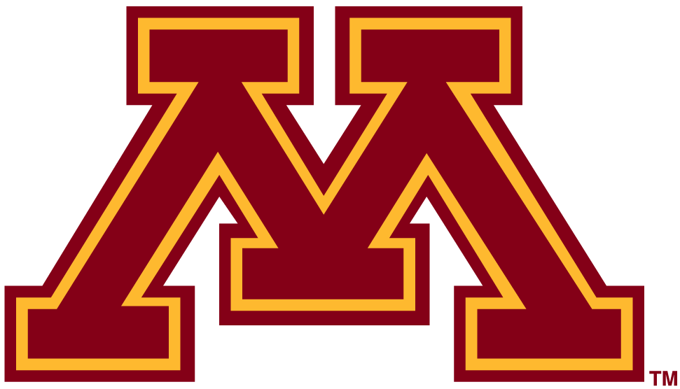
We're not getting anywhere fast this week. I apologize in advance. At first glance, this looks alright, but it gets worse the longer you stare at it. And it never stops getting worse. What makes it bad? Not only is it the letter M, but there are so many serifs (those horizontal lines) that it really takes away from the character of the logo. Nice colors though.

12. Rutgers
I don't want to talk about this one, but I will anyway. If you want to have a cool mascot, but you don't want to be too cool, take a page out of the Rutgers playbook and make your logo a plain, boring letter. A letter that has had literally nothing done to it. Although, it's better than two others in this conference, so maybe it's a good thing they didn't mess with it.

11. Nebraska
I'll be honest, this one isn't really better than Rutgers. But for the sake of not having a tie, it is. While Rutgers is bad because they could have done something better with a great mascot, Nebraska's is bad because they can't. This is probably the best thing anyone could come up with for the Huskers. That doesn't make it good.

10. Michigan
Hooray. Another letter. Dang B1G, you guys are boring. I don't even know what else I can say about this. It's another letter that has had nothing special or interesting done to it. It's a good thing the B1G did away with the Leaders and Legends divisions, because I could have made a really good joke about it here.

9. Purdue
Oooo. Italics. Now we're getting somewhere, I guess. Also, this is the only time you'll see Purdue ranked this high in the B1G. Shoot, did I say that out loud?

8. Illinois


There comes a point in time when you just have to cut your losses and go home. One of these days, I'll figure out when that is. For now, I'm going to complain about how terrible all of these logos are so far. At least this one has pretty colors.

7. Wisconsin
Oh look. Another letter. (Spoiler Alert: there are three more letter-logos still coming. I'm going to complain some more. If you want to see where I stop complaining, keep scrolling. We'll get there, I promise.) Ok, this is one of the better letters in the conference, but that's not saying much. They added a shadow and curved the letter some. Eh, whatever. It's alright.

6. Indiana
Don't ask me how this logo made it so high on my list. I think it has something to do with the fact that I almost don't see this as letters. It looks more like a trident than "IU." This logo was burned into my brain well before I started paying attention to design. While it's more synonymous with basketball, it still makes a decent logo (even if neither of these letters should be used individually).

5. Iowa
Strike up the band. We have our first non-letter logo! Unfortunately, there are only two others. Oh well. Anyway, This isn't awful, but it's not my first choice when someone asks what my favorite sports logo is. I like the concept and the colors when black is used, but it needs a little something extra. Maybe removing the bag under its eye and making it more aggressive? Just a thought.

4. Maryland
Now this, I like. The M is touched up a little without being too gaudy, and the state flag strip underneath is a fantastic touch. This really exhibits what Maryland football is all about: cool jerseys. Nah, I'm just kidding. But they really do have nice jerseys, and now a nice logo to boot.

3. THE Ohio State University
Classic, with a touch of modernity. This exemplifies OSU football right now. Getting rid of the lines that ran through the "Ohio State" was a great idea. They made a change to a classic logo without really changing it. It paid off. Nice work on this one, ya worthless nuts.

2. Penn State
 
I am all over this one. Near perfection, but the nose seems a little off. Maybe that's just me. Either way, this is still one of the best looking logos in college football. Nice color, nice look, and a very nice use of minimalist detail to convey the message that "they are... Penn Sate."

1. Michigan State
 
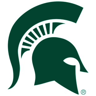
Congrats, MSU fans. You have the best logo in the B1G. Simplicity hurts some, but not here. Just the right amount of detail makes this logo a force to be reckoned with and recognizable across the country. And the green looks nice, too. Don't change, Michigan State. You're beautiful.
___________________________________________________________________

So there you have it, folks. Take it or leave it, but whatever you do, let me know what you think down below. 
Next week: Big XII

Sunday, September 13, 2015

Sports Logos Round 1: ACC

Logos.  Some are good, some are bad, and some are so ugly we wonder how in the world they were approved.  I have a thing for good logos, especially in the sports world.  It is here where a logo is all you need to differentiate between your comrades and your sworn enemies.  Unfortunately, not all logos are created equal.  That's why I've decided to share my opinions on which logos are great, and which ones could be done better.  Since the college football season is (FINALLY) underway, I've decided to tackle the best and worst of the college football logos.  In order to make it easier to keep track of which logos I've covered, I've decided to split them up into their respective conferences.  So today, I cover the Atlantic Coast Conference.  Also, I should add that I will only be judging the primary logo of each team.  If your secondary logo is better than your primary, that's an issue.  Ok, here we go.

15. Wake Forest
It doesn't matter if we're talking about the letters or the Demon Deacon himself--this logo is bad.  I understand that not every school is going to go for the modern, edgy look, but this feels like it's more of a business logo than a sports logo.

14. Georgia Tech
It's almost as if the same guy that made the Wake Forest logo decided to just "Ctrl+C, Ctrl+V" and Voila!  Just change the letters, and hey, let's squish them together a little.  Yeah?  No.  Bring back Buzz.

13. Syracuse
Alright, I'm gonna level with ya.  I'm not a huge fan of letters as logos.  There are a few exceptions.  This isn't one of them.  At least the colors make it look somewhat sports-related.

12. Pitt
Well, at least these letters make a word.  Or an abbreviation of a word.  Eh, close enough.  I'm not going to harp on them too much, but they had something going with the old panther logo.  Not that the panther looked good, but it gives you something to work with instead of these dang letter-logos.

11. Notre Dame
I know, I know.  Notre Dame isn't part of the ACC in football.  However, the majority of teams on their schedule are in the ACC, and they are a part of the ACC during basketball season.  Don't get me started on it.  As far as I'm concerned, they're in the ACC.  Anyway, back to more pressing matters.  Surprise, surprise.  More letters.  At least these letters look decent.  I'll say this much: I actually kind of like this one, especially when you compare it to that awful leprechaun logo that still shows up every now and then.  *Shudder*  That thing creeps me out.

10. North Carolina State
Ok, now we're starting to get somewhere.  Letter-logos can be alright, but there has to be something done with them, kind of like this.  While this isn't the best in the conference, it's not a bad logo.  The only thing I have an issue with is the abundance of black behind the N and C.  Other than that, there isn't much to complain about (aside from the whole letters only thing).

9. North Carolina
This is one of those logos that you kind of forget is made up only of letters.  For that, I applaud the marketing team.  This one is smooth.  The nice dark blue outline on the Carolina blue font adds just enough contrast to make it stand out without being an eyesore.

8. Duke
Alright, Duke fans.  Quit gloating about how your logo is better than UNC's.  This is another example of a logo that makes you forget that it's just a letter.  It's simple, yet sharp and instantly recognizable--all trademarks of a great logo.

7. Florida State

Finally.  Something that's not just letters.  Don't get me wrong, letter-logos can work, but most don't.  Anyway, this logo finally got the update it deserved recently.  The warpaint looks less like bacon and more like, well, warpaint.  The Seminole himself looks ready to go into battle, something FSU fans have had to do numerous times over the past couple of seasons.  Getting rid of the "Florida State" in the feather and replacing it with "FSU" was also a nice, modern touch.

6. Clemson
Another simple yet sharp logo.  The thing that really draws me in with this one is the fact that it's not clean-cut.  The imperfections around the outline make this logo come alive, as if a real tiger left this print while stalking its Gamecock prey.  Nicely done.

5. Virginia Tech
Write this down.  I like this letter-logo.  Something about it catches my eye.  Maybe it's the colors.  Maybe it's the sharp angle of the text.  Maybe it's the colors.  Say what you will about the team; they have a pretty great logo.

4. Miami
Phew.  It doesn't get a whole lot better than this.  Yet another simple logo that is instantly recognizable.  And the colors.  Mm.  I'm all for this one.  Also, bonus points for the hand sign.  Genius.

3. Boston College
Although BC's football program has been a little off the radar for a few years, their logo should be on everyone's radar.  I didn't realize how great this logo was until I started working on this article.  The letters are sharp without being edgy, and the eagle is the perfect blend of realistic and cartoon.  This one gives the two logos ahead of it some serious competition.  So much so, I'm not sure I wouldn't rank it higher on a different day.  This is how you make a logo.

2. Louisville
Cardinals don't have teeth--unless you're a Louisville fan, that is.  One of my personal favorite logos of any level of any sport, this cardinal means business.  This is a prime example of how to take a non-threatening animal and make it look like it's going to beat the life out of the next thing that moves.  Everything about this logo screams perfection.

1. Virginia
Ah, here we are.  The top of the ACC logos.  There is absolutely nothing to change or criticize about this one.  the designers definitely knew what they were doing here.  Everything from the crossed swords to the noble font used for the V comes together in a beautiful, classy perfection that exudes Virginia Cavaliers.  Absolutely wonderful.

So now I've covered the ACC logos.  What do you think?  Did I make the right calls?  What awful blasphemy did I commit by excluding your favorite?  Let me know down below.
Up next: B1G.  If you thought the ACC had a lot of letter-logos, heheh you just wait.